Creating an Attractive Campaign Page for Kickstarter and Indiegogo (and What to Avoid)
Having an attractive campaign page is a huge selling point. It doesn’t matter what your product is, if you’re not showing it off the right way, you’re wasting your time! The presentation is just as important as the products themselves and you’ve put a ton of work into your product- so why not put work into your campaign page too?
It’s easy to get carried away with content or create a confusing layout, especially if it’s your first campaign. Luckily, we’ve seen our fair share of campaigns to know what looks good and what works!
With some time, and a little nudge in the right direction, you can set up an attractive campaign page that sells and that you’ll be proud to show off! Let’s impress your backers!
Prep Time
Step 1 – Layout and Concept
Before you type a word into Kickstarter, go through the skeleton of your campaign page, figure out what you want the flow to be and arrange the layout in a way that makes sense from a backer’s perspective. What info would you want to see as a backer?
Step 2 – Title and Product Positioning
You’ll also want to think of a name for your campaign that grabs interest and defines your product, but won’t get lost in a sea of similar titles. Avoid “World’s thinnest/first/best” anything. Although it might be true that your product is the world’s best something, leave this fact for the description and find another way to make your product stand out like Orii did.
Step 3 – Page Content
Take your time thinking about exactly what you want to say and how you want to say it. Then edit, edit and edit some more. Check out an attractive campaign page that you admire- what do you love about it?
Kickstarter recommends including the following on your page:
- What it is you are trying to create
- How you plan on doing so
- Your budget, and how you plan to use your funds
- Your story. Let your backers know what brought you to Kickstarter.
- The progress you’ve made so far. How far along is your project?
What Information Should You Include on your Campaign Page?
First, you want to introduce your product(s).
The intro doesn’t have to be long; a simple paragraph will do! A great intro allows you to start off the tone of the page, so if your intro is awesome, your page will most likely be awesome too!
Flexr does a great job of introducing their product and transitioning into the description.
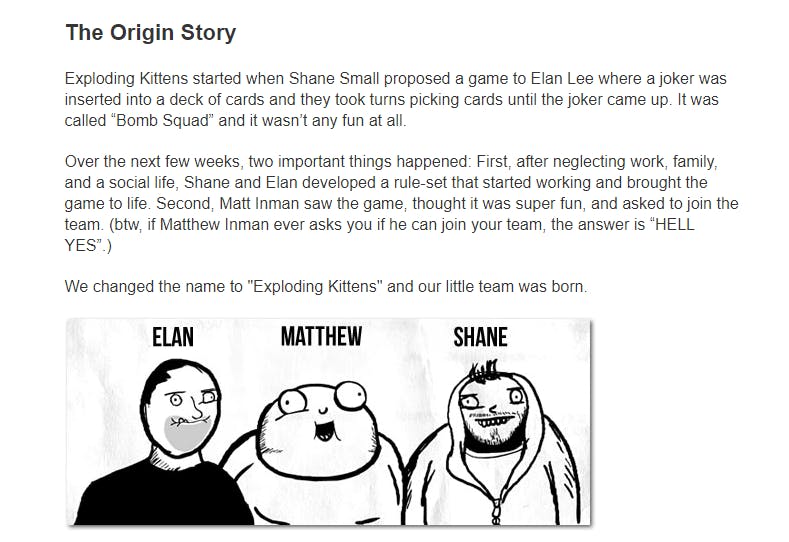
Your content should reflect your product style. Get creative! Exploding Kittens was a hugely successful campaign and their game was explained in a super fun way. Check out how they took aspects of the game (the illustrations for example) and made them a part of the origin story, keeping the fun vibe throughout their attractive campaign page.
Describe it!
After introducing your product, you’ll want to talk about it! The description is where you can explain what your product is, and why people need it. Give real life examples of an issue and how your product can solve it. Liberty does a great job of explaining what issues they’ve seen in wireless ear buds and how their product fixes these issues. Smart!
Anticipate commonly asked questions you think you’ll receive about your product(s) and include them on your page. Why do you think your product is going to make a difference in someone’s life?
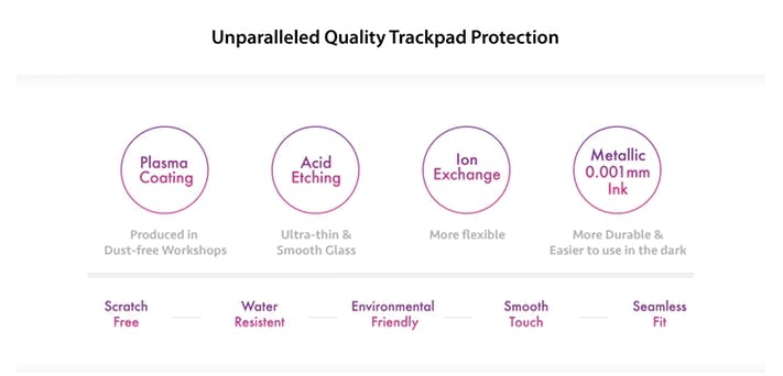
Your description of your product(s) should be in short paragraphs separated by pictures. Remember, we’re visual beings, so whenever you can create a simple graphic explaining features or uses of your product, do it! Too much text deters people from reading the important stuff you want them to know. Plus, getting creative is great! When you make visuals it allows you to tie in your themes and colors of your campaign, like Nums did:
Check out Canva to create easy to make, professional looking images, for free!
Photos
Be sure your photos are attractive, simple, and pleasing images. They should be, or at least look, professional. This is one of the first things people are seeing on your campaign and first impressions are everything (just ask your in-laws)! People want to know that your product(s) are the real deal and having clean, great looking photos of them is the best way to prove it!
Avoid:
- Photo collages or busy images
- Too much text on the image that can take away from what you’re really trying to show them
- Poor quality photos
Simple is always best, but it definitely doesn’t mean boring! Get creative with angles, backgrounds, and set up- just make sure your products are clearly displayed.
Share Your Story
People want great products, but most also want to help passionate, interesting, and creative people achieve their dreams. Often times, your story sells more than your product- people are investing in you.
Include a little background about yourself and why this project is important to you, including a photo or two of you and your team. It personalizes the products, creates a sense of trust and adds a human element to crowdfunding- which is why crowdfunding is so great to begin with! People helping people- nothing better than that!
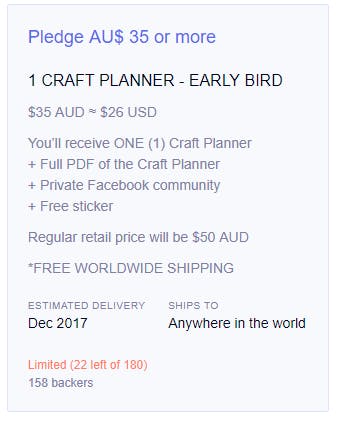
Reward Levels
You’ll want to spend some time creating reward levels that are clear and concise but also intriguing!
Sound tough? Here are some quick tips to follow to set you on the right track:
- Make sure you can clearly tell the difference between each reward level. If they’re too similar, it can cause confusion.
- Write clear, short descriptions of each reward level and what’s included. It’s a great idea to use bullet points to show it in a clean, visually pleasing way.
- Avoid additional descriptions about why the product is great. That can be saved for the content on your campaign page.
- Set limits on some reward levels. People love to be the first to get their hands on something and having limits created a sense of urgency.
- Show the retail value of each reward. Knowing that your products will be more expensive to purchase through retail will attract people to committing now instead of later
Check out this post for more advice on reward levels.
Show it off!
If major media outlets are talking about you, don’t be shy, brag about it! It adds huge credibility and backers will be impressed if you are being recognized. Backers will trust names they know and think “If big companies love this product, then I might too!”
You could have a header titled “As seen on” or “Featured on” to start this section. Don’t just create a list, use images (with permission) of the websites or blogs that your campaign has been featured on. Remember when I said people are really visual? Of course you do! That was a test.
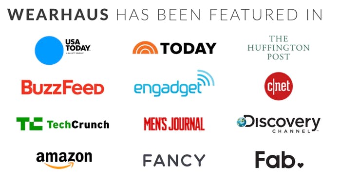
This is an optional section, but if you have it, flaunt it!
Don’t have publications? Don’t worry, this is also a great place to share testimonials of people who have tried out your products!
Check out this blog post that explains how to reach out to press.
You’ve put so much work into developing great products that you want to share with the world- don’t let people pass them by because you have a confusing or overwhelming campaign page. Take your time to create an attractive campaign page that showcases your product and your story in a creative and organized way and people will rave about it. Heck, they might even tell everyone they know.
Learn about how Kickbooster's referral marketing tool can help you spread the word about your campaign.